For this project, I researched a brand and created a flexible logo and associated advertisement campaign that fit with the brand’s identity.
Research
Logo
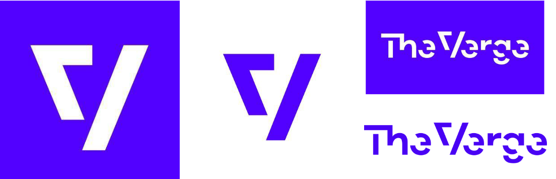
The main icon of The Verge is the V from their full text logo. It’s separated into two pieces that are reminiscent of an apostrophe and a forward slash. To me, this is representative of The Verge’s crossover between journalism and technology.
Colors
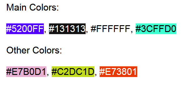
The main colors of the Verge are purple, dark gray, and white, with a seafoam accent color. They also use several other colors, namely pink, yellow-green, and orange. All of The Verge’s colors are very vibrant and “pop” off the page.
TheVerge.com
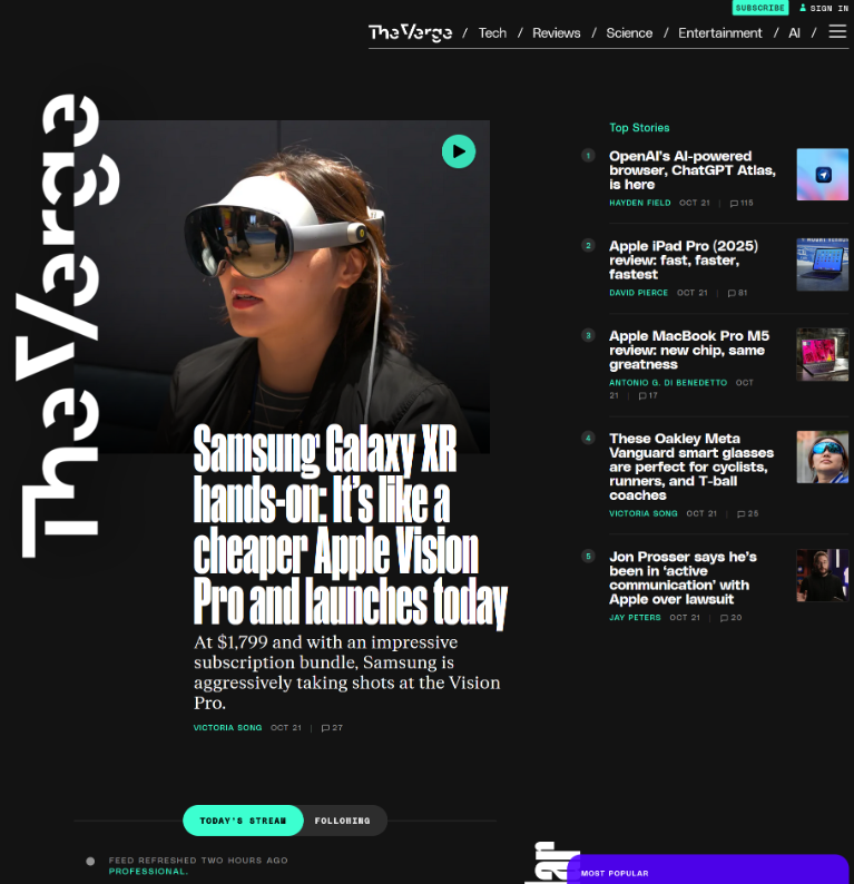
The Verge is most well-known for its website and news reporting. It covers all aspects of technology and digital media, but is most focused on “gadgets” and reviews of all the new devices that come out each year.
The Verge is very focused on modernism in journalism and not just reporting on technology, but implementing it and its novel mediums into the way it reports. For example, The Verge has recently been moving towards federating its site and has implemented small live posts that provide information quickly, similar to a tweet.
The website breaks the convention of many news organizations, which often just replicate the design of a traditional newspaper, and instead focuses on organically sorting content for the user and providing breaking news through the aforementioned live feed. The Verge is focused not only on tech but on the ways that journalism and design overlap with it.
Podcasts
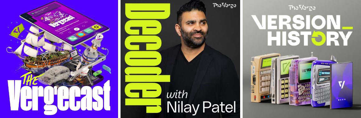
The Verge has several very popular podcasts. In the design of these, you can see a clear focus on analog hardware in a 3D stylized style. This calls back to their focus on gadgets and physical technology. They also have a consistent font between the Vergecast and decoder.
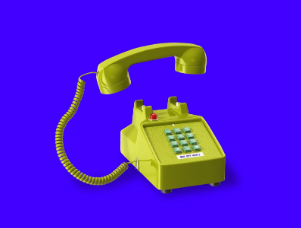
The phone from the intro to the “Vergecast Hotline”
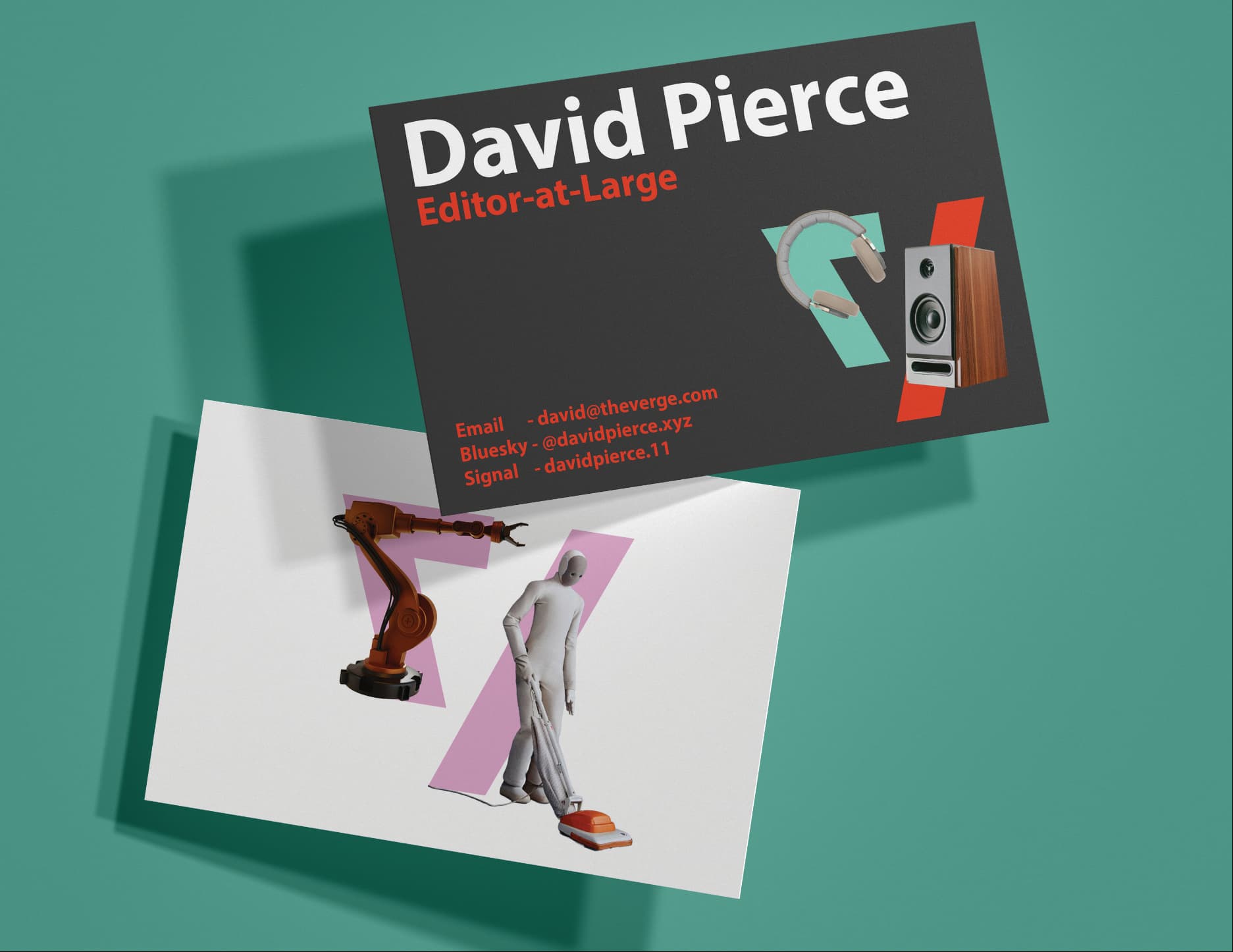
Flexible Logos

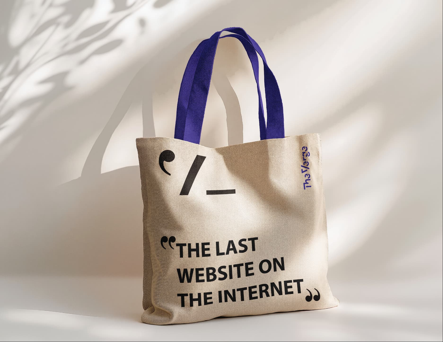
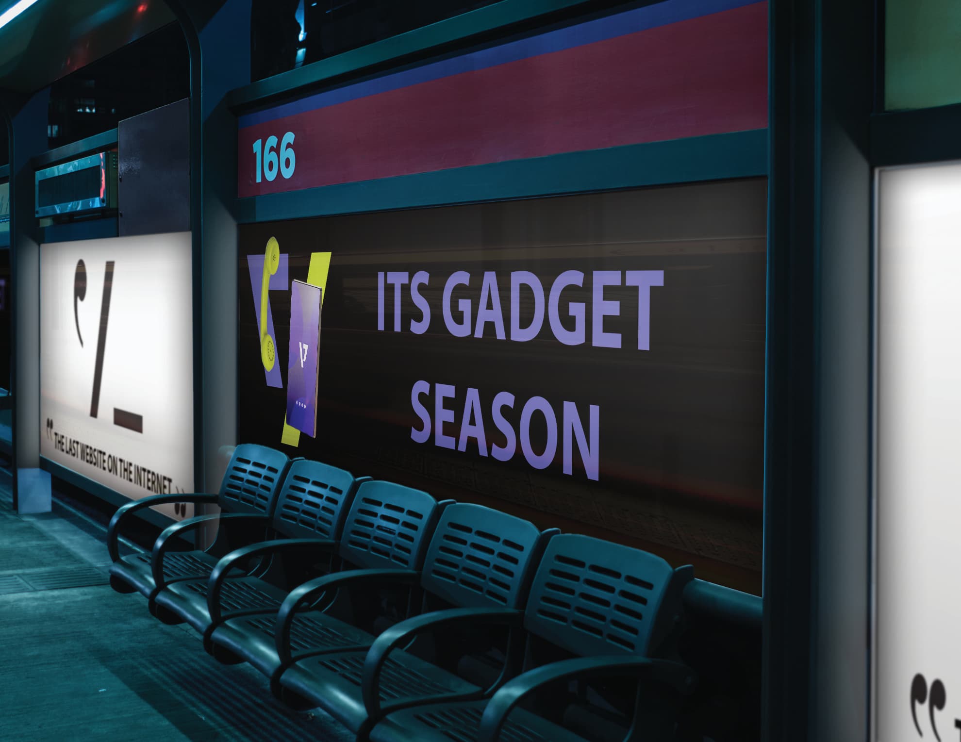
Campaign Mockups